Expertise
Crafting interactive & experience design
Experience design as experience craft
There's a version of experience design that happens in Figma. Grids. Components. Spacing tokens. Redlines.
At Merlin, experience design means experience craft: the obsessive, iterative work of making every pixel, every transition, every micro-interaction feel exactly right.
We design experiences from the inside out. Starting with how something should feel, then working backwards to how it should look, and then how it needs to be built to feel that way at all.
Our designers and engineers work in the same room from day one. That's what makes the difference.
The design-first principle
We are a code boutique with a design-first philosophy. Those two things make each other better.
What "design-first" means at Merlin:
That last point is important. Figma prototypes lie. They show you a version of the interaction that doesn't account for real scroll physics, real device performance, or real user behavior. Building browser prototypes early saves weeks of pain later.
We used this approach on SKKY Partners, a private equity firm for Kim Kardashian and Jay Sammons. Pixel-perfect design, elegant transitions, and accessibility baked in from the start.
Interaction design: the details that define everything
Ask people what they love about a great digital experience and they'll usually describe a feeling, not a feature.
"It just felt smooth."
"It felt like it was made for me."
"I don't know, it just worked."
Those feelings come from interaction design. From the spring easing on a modal. From the way a hover state anticipates where your cursor is going. From a button that gives tactile feedback without you noticing it's doing so.
Interaction design is the discipline of making digital things feel physical. Good physical objects have weight, texture, and resistance. Digital experiences can have these qualities too, through considered motion and response.
The details that separate good from great:
None of these are complicated individually. Getting all of them right, consistently, across a full experience is the work.
Scroll, cursor, hover: the invisible language
The browser has a vocabulary that most experiences ignore.
Scroll is a narrative device. The rate at which elements enter and exit the viewport, the parallax depth of layered elements, the moment a sticky element releases: these are storytelling choices. When Erthos® needed to take users through a brand's mission to rid the world of plastics, we made scroll the guide. Each section emerged as a new chapter. The experience rewards curiosity and forward momentum.
Cursor behavior is an expression of personality. A custom cursor that trails, rotates, morphs, or disappears on certain elements tells the user something about the brand before they've read a single word. Used well, it makes an experience feel handcrafted.
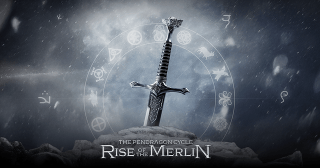
Hover states are opportunities. Hover can reveal depth, suggest interaction, provide context, or simply delight. On Pendragon: Rise of the Merlin, hovering over characters and locations within the world revealed layers of backstory. The interaction was the exploration.The cursor, the scroll, the hover: these are the first things users experience and the last things designers specify. That's backwards.
Accessibility without compromise
A common misconception is that accessibility and aesthetic ambition are in tension. They're not.
We've built experiences that are among the most visually complex work in our portfolio and made them accessible to nearly anyone. The SKKY Partners site is a good example. Elegant, motion-rich, and accessible even through complex transitions and animations.
Merlin was one of the world's first to make interactive 3D in the browser actually accessible on a governmental level. Take a look at Eurovision Village
In practice, accessibility-conscious development means:prefers-reduced-motion so users with vestibular disorders don't get sick from scroll effects
None of this compromises the visual experience. It just takes intention. And for us, it's non-negotiable.
Designing for motion from the start
Motion is information. It tells users where elements came from, where they're going, and how they relate to each other. A page transition that slides left communicates something fundamentally different from one that fades or one that scales. These are design decisions with semantic weight.
We design motion systems, not just individual animations. A motion system defines:
For the Eurovision Village project, we were building a 3D city in the browser. The motion design had to work at 60fps on a wide range of devices, feel spatially coherent, and communicate clearly that users were navigating a virtual space. Getting the camera movement, element transitions, and UI animations to feel like a unified world required a motion system designed from day one.
From identity to experience
We turn identity into experience, one that takes off, flows, and lands with the people who matter.
A brand identity is a set of visual decisions: typefaces, colors, shapes, a logo. An experience is what happens when those decisions become dynamic, interactive, and responsive to a user.
The translation from one to the other is deliberate work. A brand's typeface at 72pt in a static mockup behaves very differently when it's animating across a WebGL canvas. A brand's color palette needs to account for the glow of screen light, the dark mode preference of a user, and the VRAM cost of a texture.
We work with brand identities and push them to their digital limits. We express them in a way that static design never could.
For Erthos®, the brand's commitment to eliminating plastic became a motion-and-video experience that made you feel the mission. The visual language translated. The emotional impact increased.
Web Experience
Experience and interaction design at Merlin is the discipline of making digital work feel as alive as it looks. From the first motion system decision to the final hover state, craft is the constant.
